UX/UI
Healthcare
UX
User Research


This case study explores how a research-driven solution helped optimize the scheduling process, website, and a mobile-first experience.
The Situation: Is WellNow’s online scheduling an issue, and why?
The discovery stage:
Let’s define the main problems we want to solve
“What the hell do I click on if I want to schedule a virtual visit,
and not start one?” (Userlytics quote)

“I didn’t even click submit yet, why is everything all red?”
“There are so many times, like every 10 minutes, it's overwhelming… and why are some buttons blue up top, some in the middle, and then again at the bottom? I wasn’t sure which ones actually did something.”
Action: My role as the lead product designer was to…
Identify usability bottlenecks through quantitative and qualitative research + perform a site-wide UX audit.
Redesign the scheduling experience to improve usability and conversion rates.
Redesign the Navigation + restructure the landing page to improve and optimize the home page experience
Ensure the platform was mobile-friendly and accessible.
Align UX solutions with business goals while presenting ideas to stakeholders.
Increasing patient retention and lower cancellation/no-show rates.
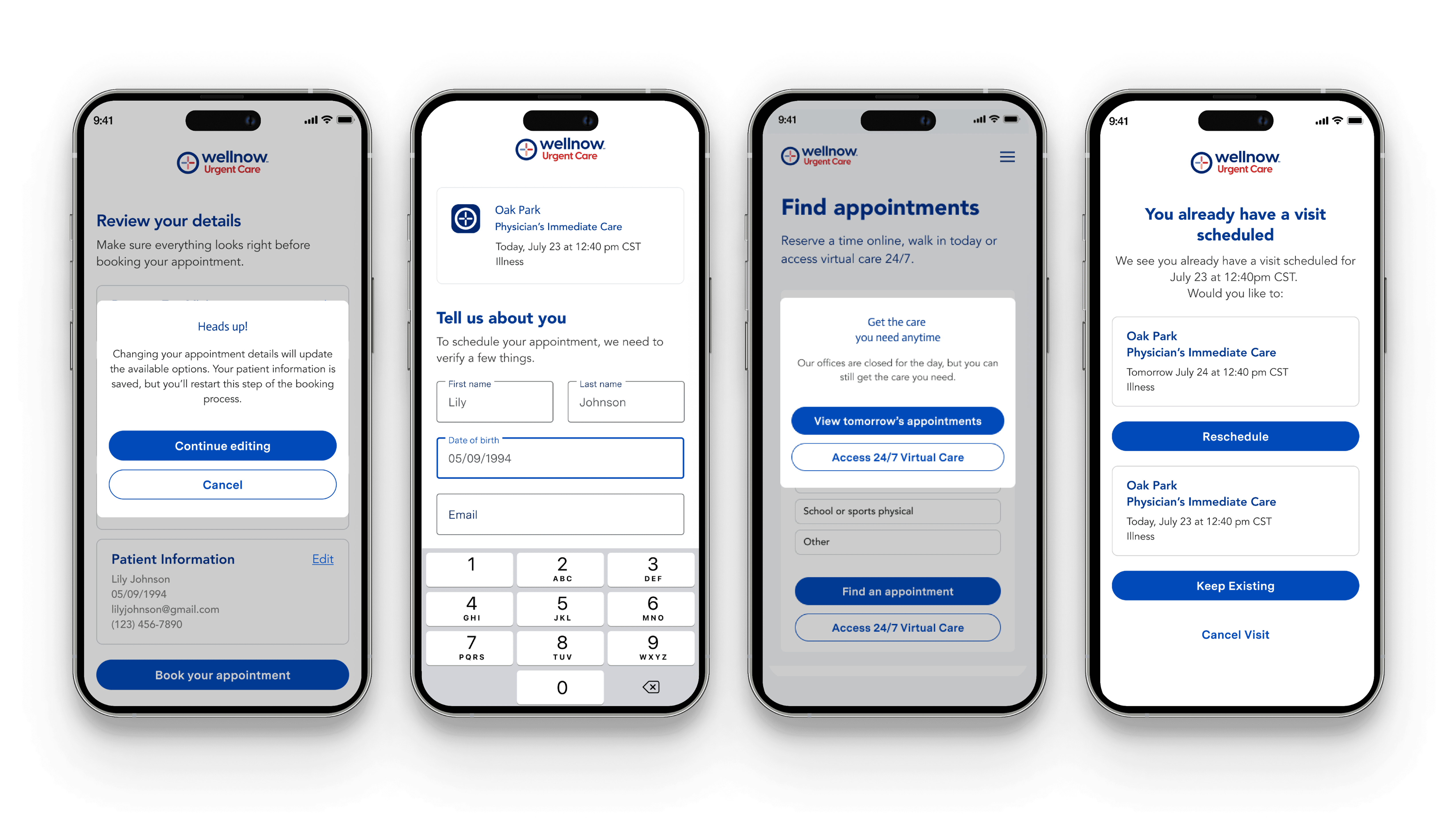
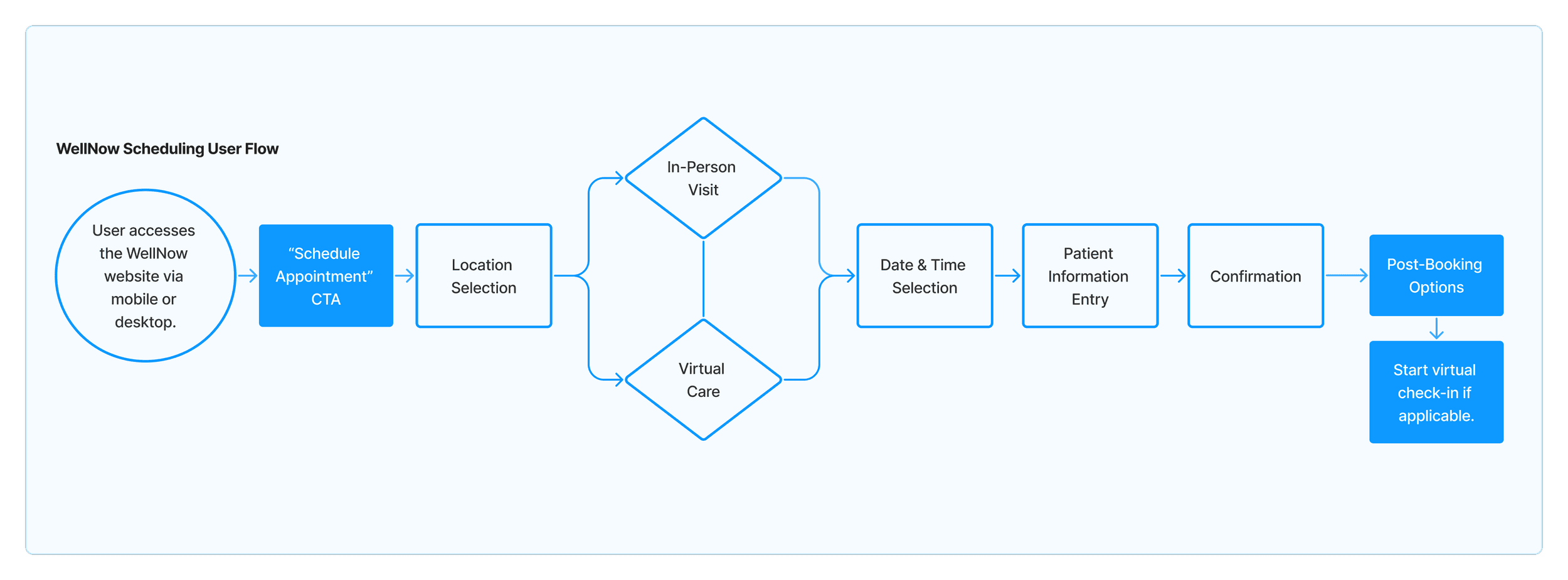
WellNow Scheduling User Flow
User Research:
Don’t Make Me Think! (My goal for users)
I led the UX redesign of the WellNow urgent care scheduling flow by:
Conducted user tests with users and existing patients to verify and discover scheduling pain points
Competitive analysis (Midwest Express Clinic, UChicago Medicine, CVS Minute-Clinic)
Benchmarking against Baymard Institute best practices for online booking flows, including guidance on progressive disclosure, default selections, and prioritizing immediacy to reduce decision fatigue
Fast, light, frequent testing (6 users)
Think-aloud protocols (verbalize their thoughts as they navigated the website)
First-click testing for scheduling copy
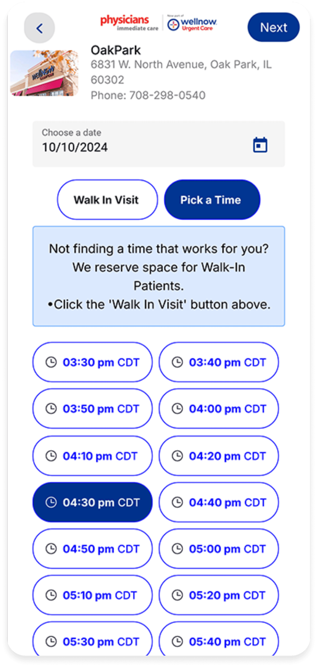
Updating button hierarchy to better support both time-selecting and walk-in behaviors
Stakeholder reviews to validate the new structure and refine language/copy for clarity
VWO A/B testing
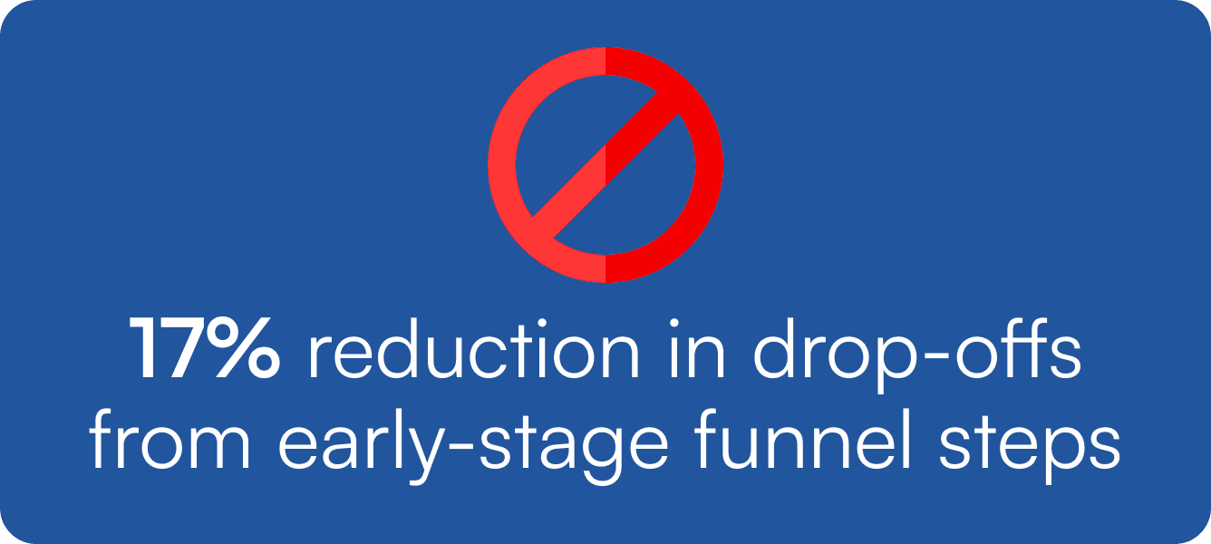
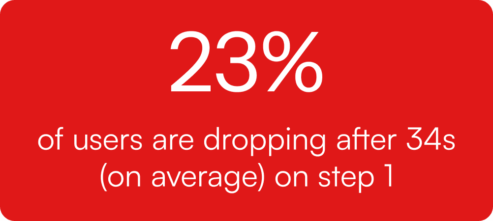
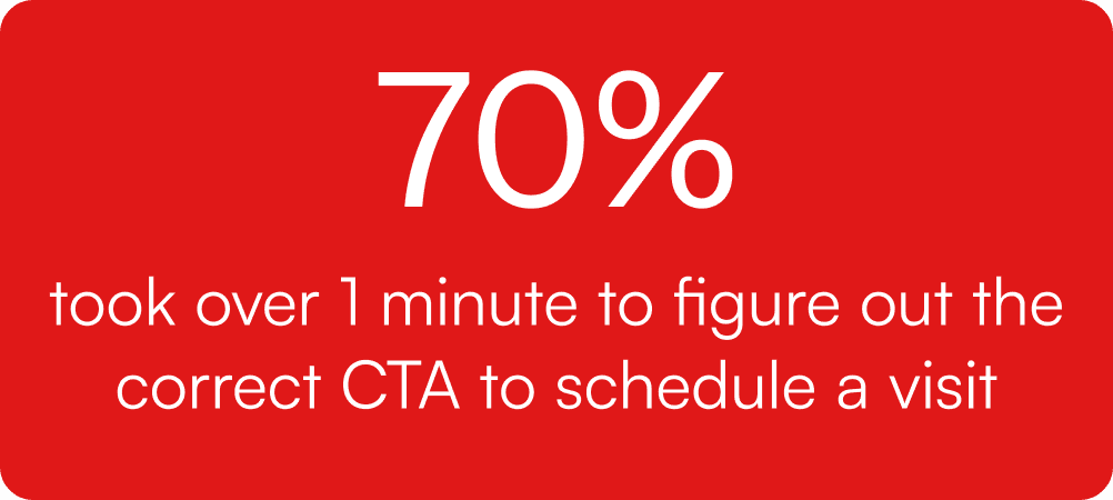
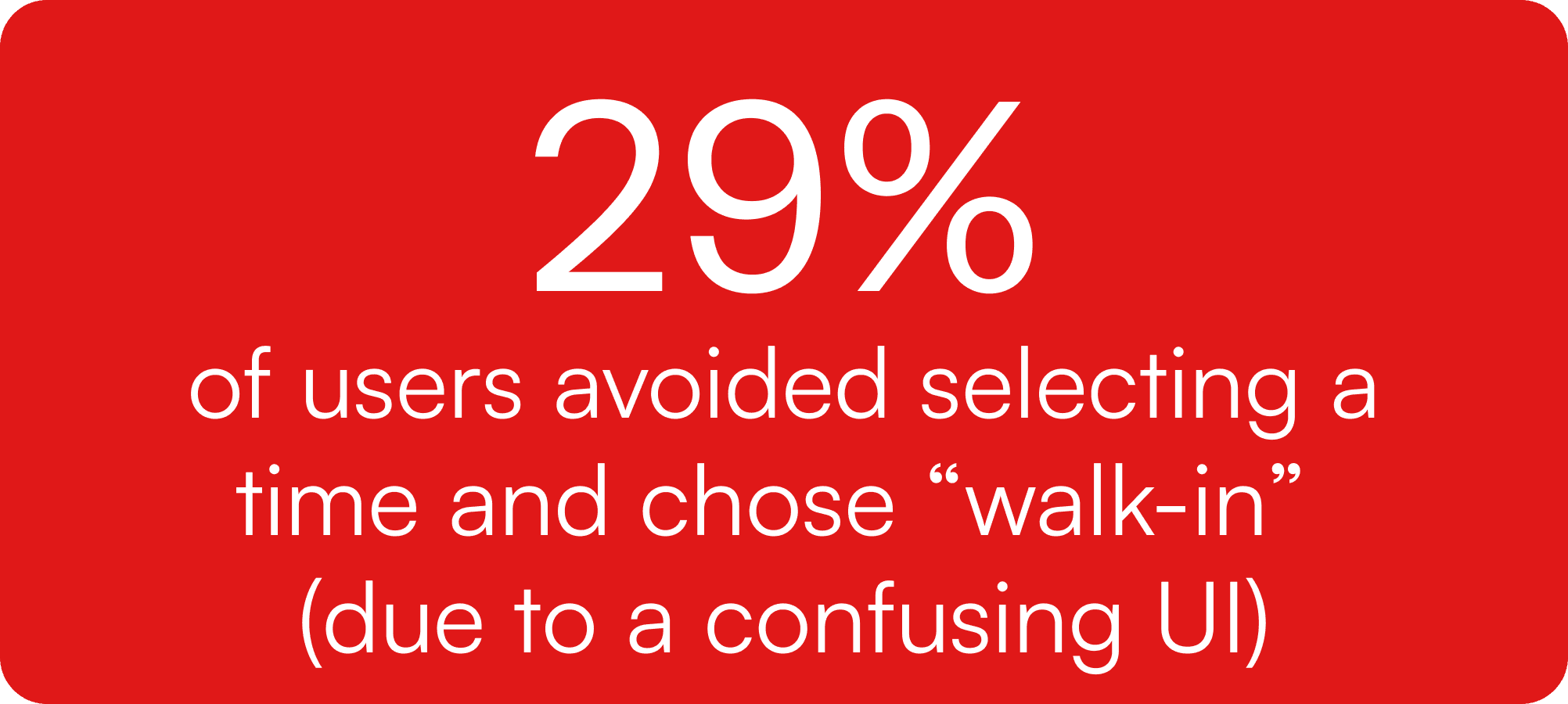
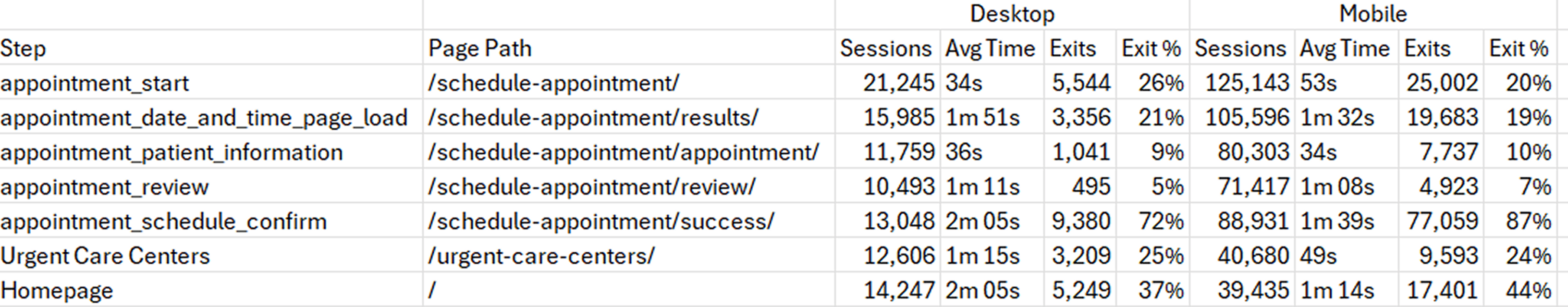
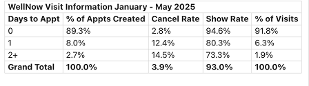
Analyzing UXR heatmaps and funnel data Identified that appointment scheduling had a high abandonment rate:
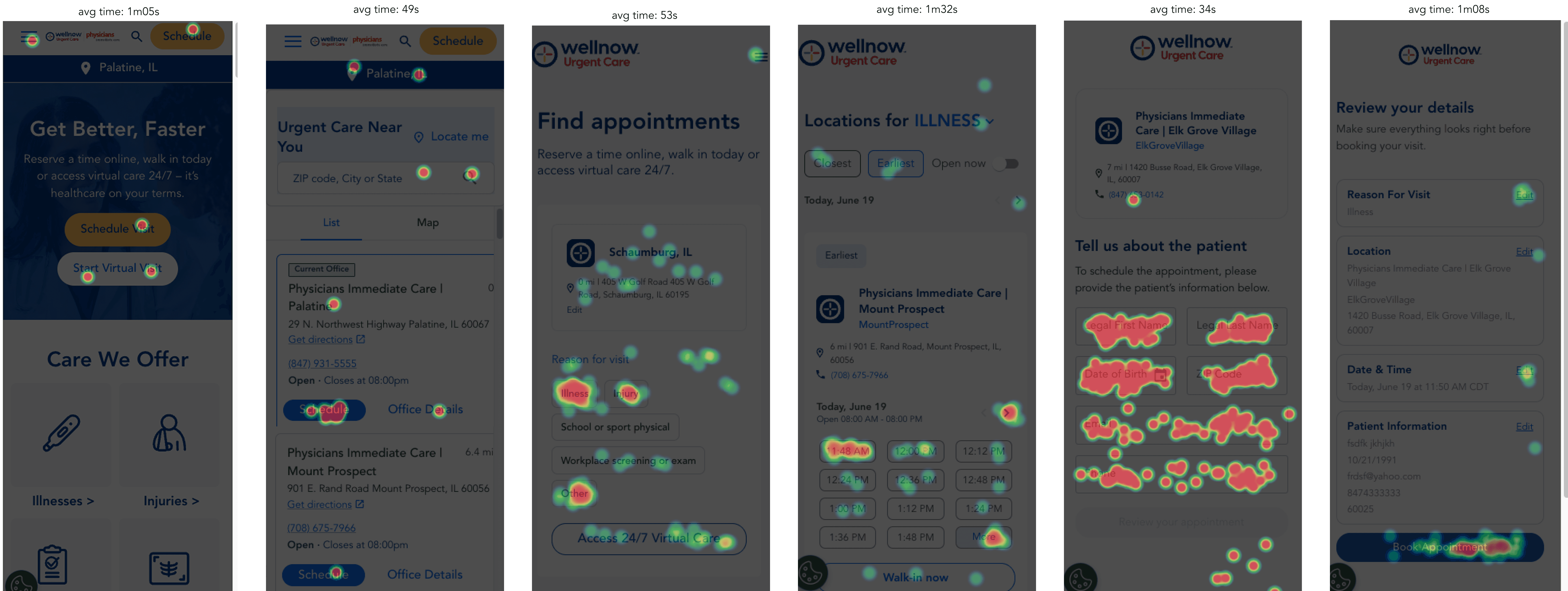
Funnel data to identify exactly where users drop off and time spent per page:
Combining the "Reason for Visit" with the date/time selection screen based on click-tracking data and scroll behavior that showed users spent more time than expected selecting a reason/time:
Before & After
Navigation Redesign + Validation

New navigation to follow the rest of the Aspen brands to include hover-over drop downs, chevrons,
and opening pages in new tabs when applicable.
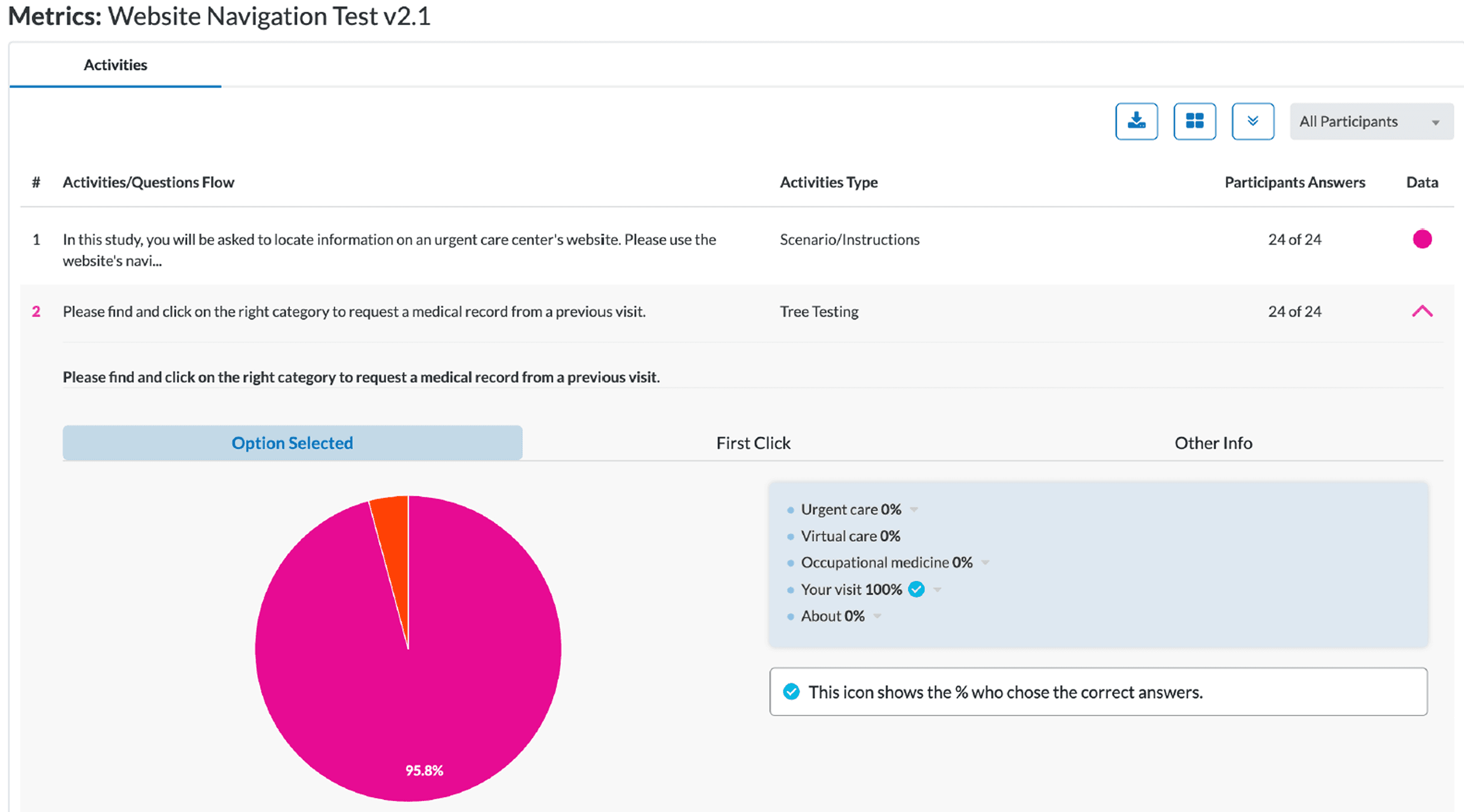
UXR Tree Test Results:
95% accuracy on find-ability with the new navigation.
(tested twice with 50 users total until I got at least 90%)
Homepage CTA User Research Results
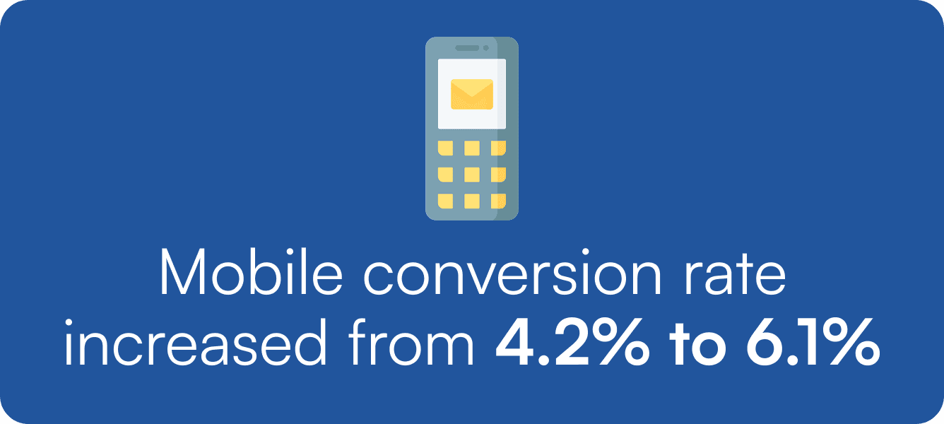
28.45% increase in virtual visit CTA clicks after A/B testing clearer button labels.
9/10 took less than 45 seconds and 1 took under 75 seconds
Stronger Impact on Virtual Visit Clicks
Limited Impact on Actual Appointment Completion
Clearer CTA Copy Improves Click Engagement
Clicks on left CTA: +3.5% @ 87% statistical significance
Clicks on right CTA: +11% @ 92% statistical significance
Appts Completed: +3% @ 55% statistical significance
After

Version 2 with more clear copy (New)
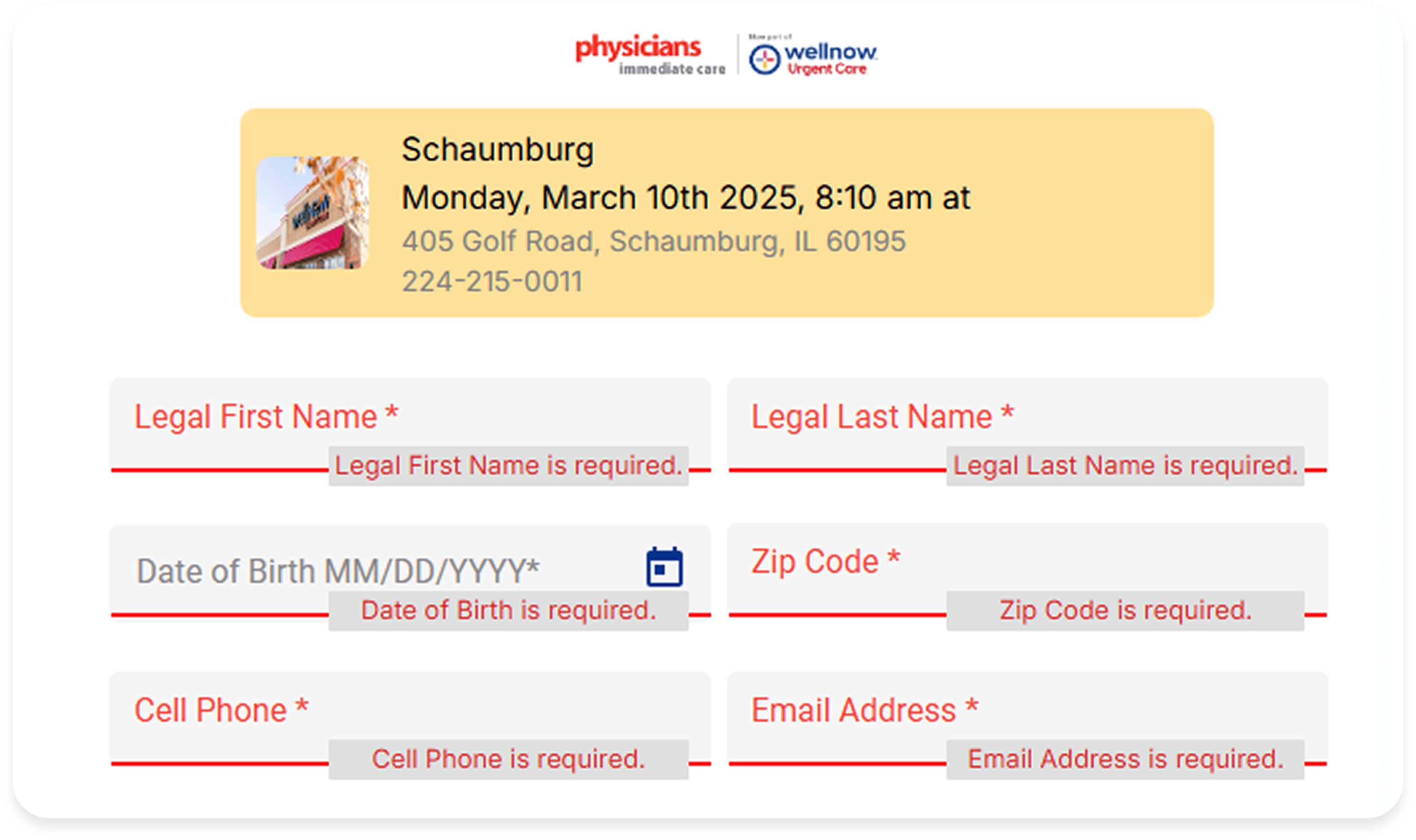
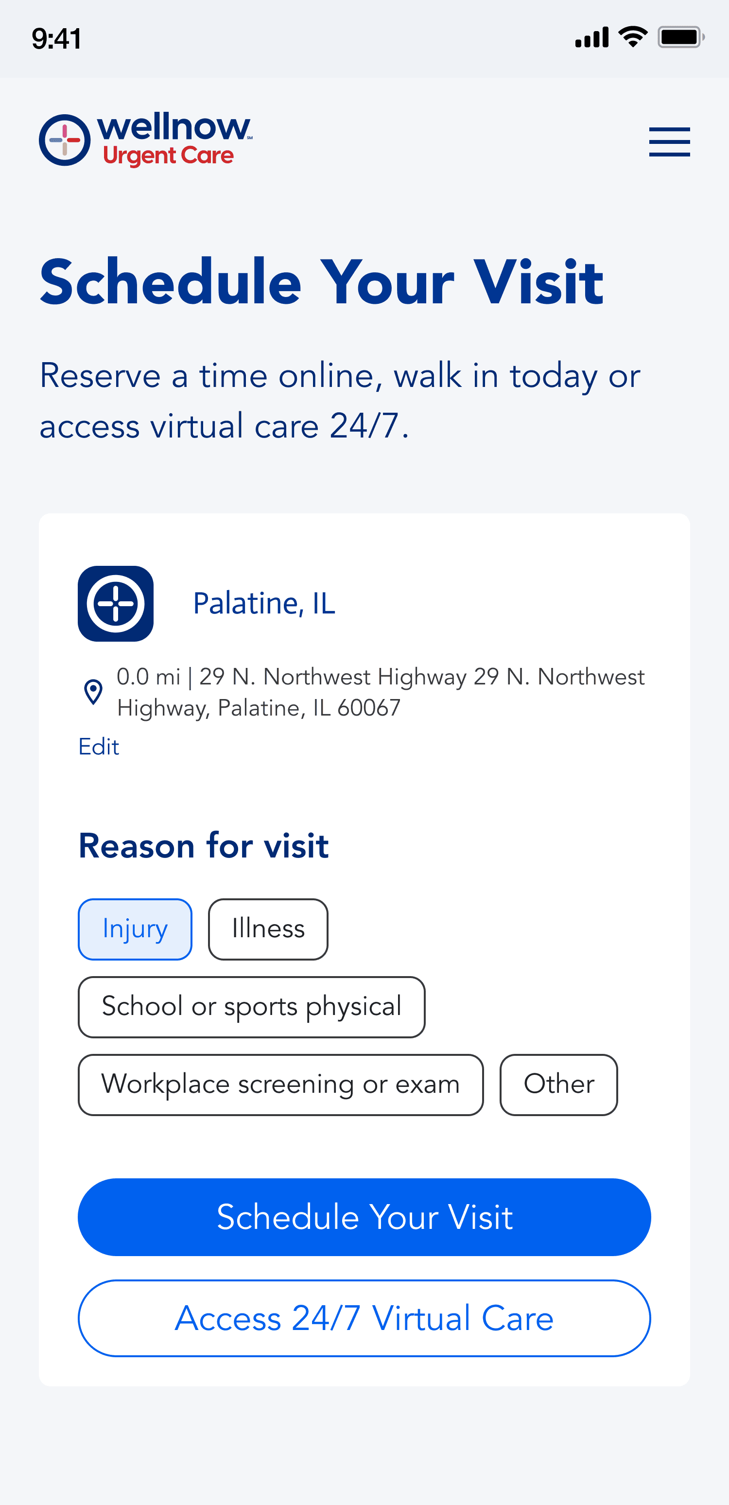
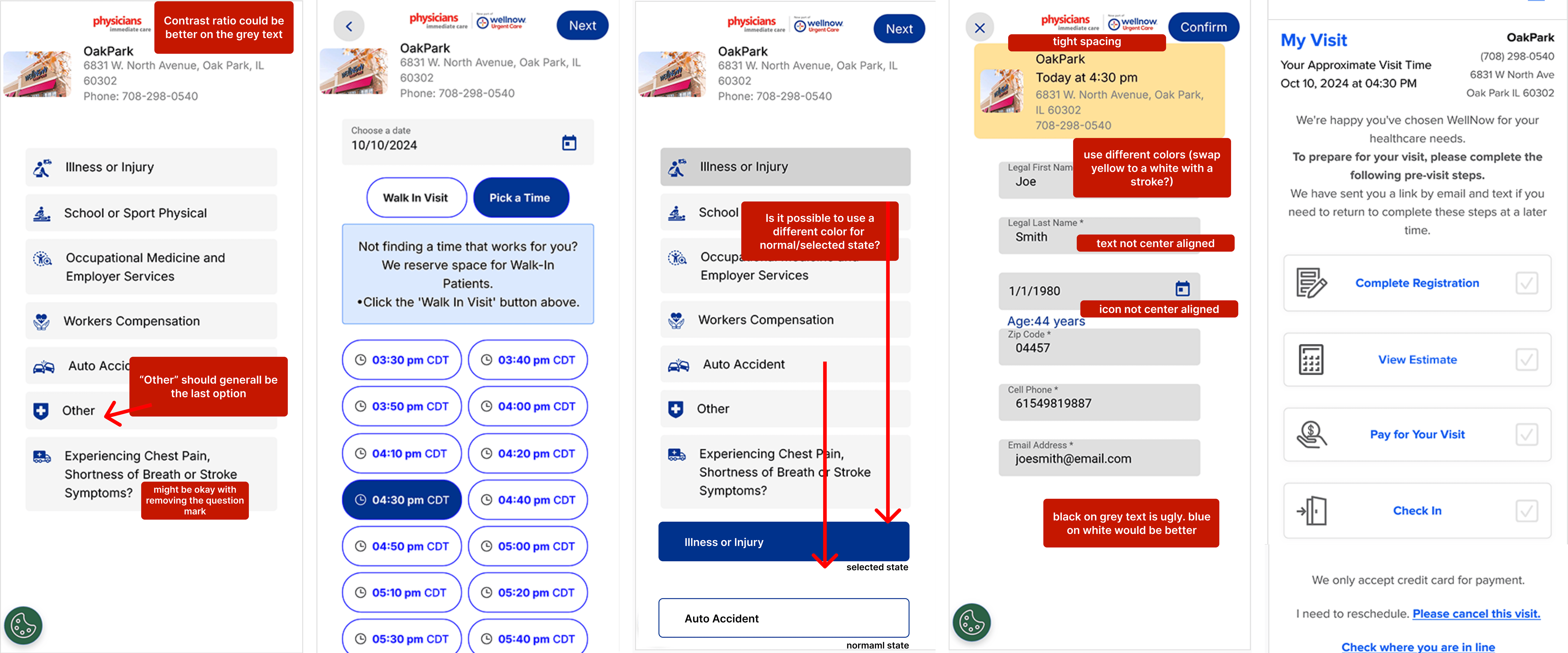
Old Scheduling Flow (with notes from my audit)
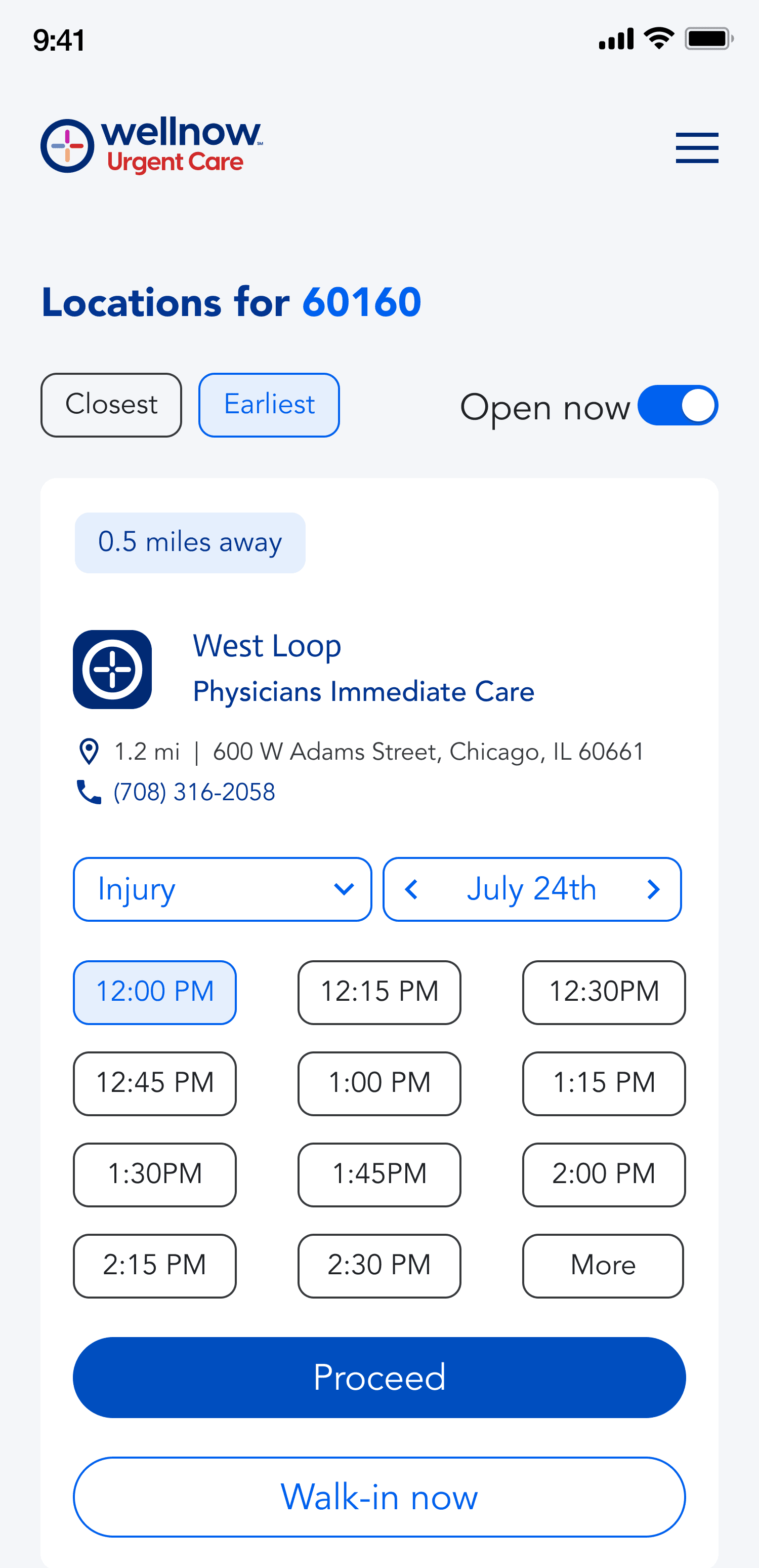
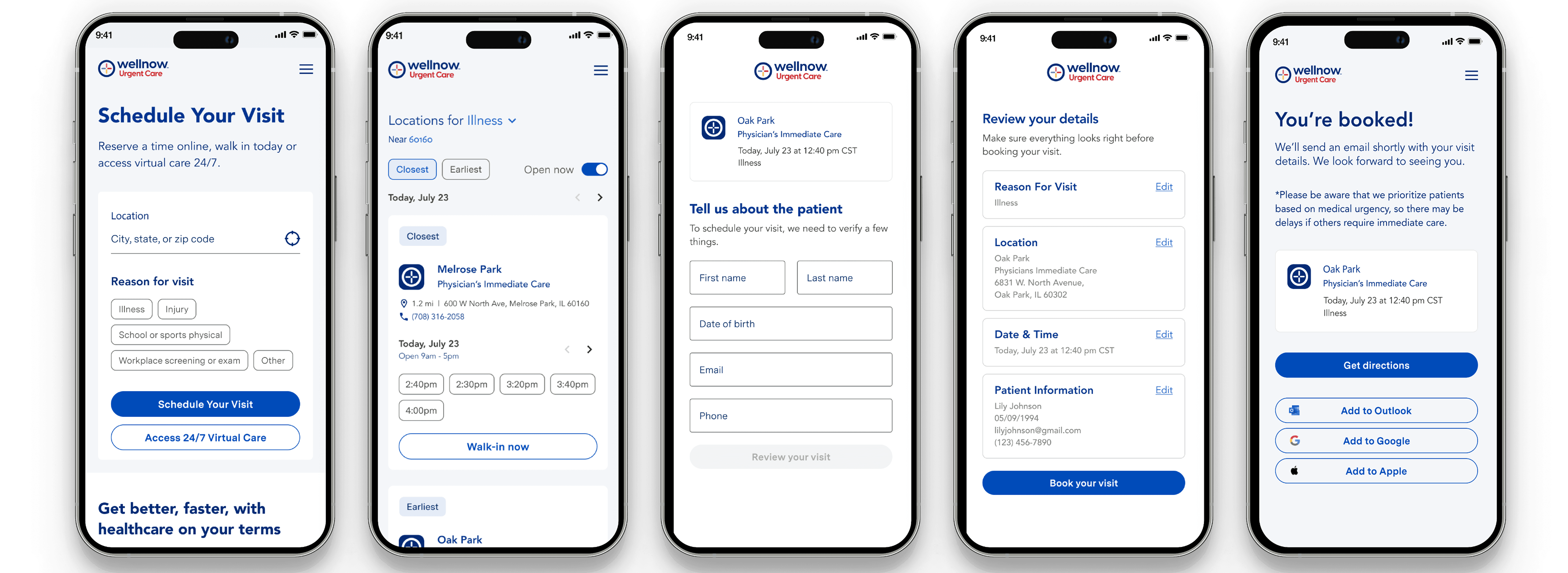
New Scheduling Flow
Corner Cases + Cancel/Reschedule Appointments