UX/UI
UX/UI Designer
E-commerce
Web Design
Mobile Design
Design System

My roles
UX Ownership: Co-led UX for search and navigation improvements across PerkSpot’s web and mobile platforms, focusing on discoverability, usability, and engagement.
Design Systems: Designed and maintained a scalable design system and style guide to ensure UI consistency across experiences, streamlining collaboration with development teams.
Search Experience Design: Reimagined the search flow by introducing auto-complete, relevance-based sorting, and mobile-first optimizations, thus enhancing how users explore perks.
Collaboration & Execution: Worked cross-functionally with product managers, engineers, and QA to prototype, validate, and ship high-impact features with speed and clarity.

This case study explores how a redesigned search and navigation experience improved discoverability, accessibility, and user engagement across PerkSpot’s web and mobile platforms.
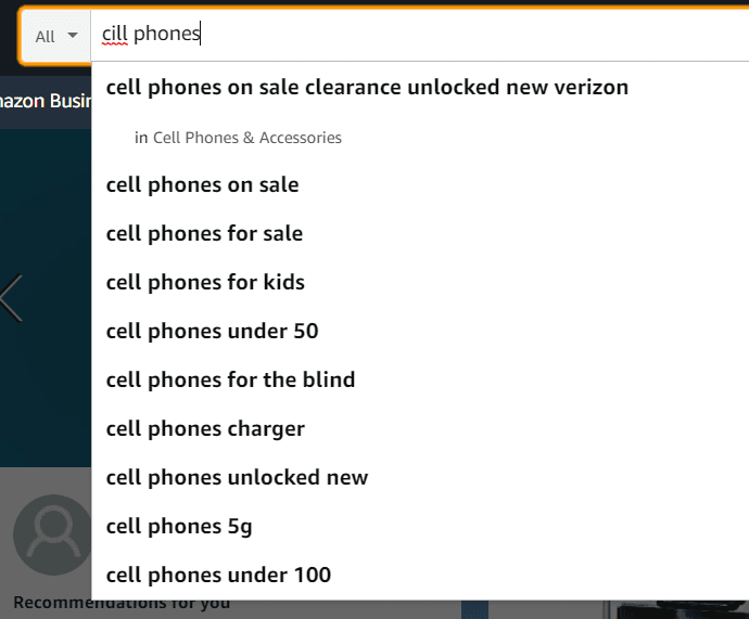
No autosuggestions or auto-complete: Users had to type full searches manually.
Limited search filters: No way to refine search results based on categories, brands, offers or price.
Poor relevance ranking: Results didn’t prioritize top deals, causing users to scroll excessively.
No handling for typos or synonyms: A small misspelling led to "No results found."
PerkSpot’s (outdated) search functionality
So picture this:
You’re invited to PerkSpot through your company’s benefits program.
You accept the email invite, create a login, and finally sign in.
You start browsing, but the search? It’s clunky with no suggestions, filters, or typo correction.
You get frustrated. You can’t find what you’re looking for. You close the tab. Sound familiar?

There was no auto suggestion, no auto-complete, no filtering, no visually appealing results, no auto correct.
After:
Real-time Results: Users get instant feedback as they type, speeding up discovery.
Search Query Highlighting: Bolded search term reinforces clarity and context.
Grouped Results: Offers, brands, and categories are separated for easier scanning.
Scannable Layout: Clean typography and hierarchy make deals easy to skim.
Clear CTAs: “View All” and “See all results” guide users to full content if needed.
Visual Consistency: Uses brand colors, rounded elements, and clear spacing.
Persistent Context: Logged-in state, points, and nav stay visible for seamless continuity.
Task:
Improve user satisfaction and engagement
Reduce time-to-discovery
Increase redemption and checkout rates
Aligning with technical constraints and business objectives.)
Action:
How did I do it
Research & Discovery
• Audited existing platform via heuristic analysis and Google Analytics (40% search abandonment rate).
• Reviewed Hotjar heatmaps and conducted 50+ user interviews (70% wanted filters and suggestions)
• Benchmarked competitors (Amazon, Rakuten, Redbubble) to identify UX best practices.
Strategy & Ideation
• Mapped pain points with PMs using affinity diagrams.
• Ran heuristic evaluations and collaborative FigJam sessions.
• Defined UX goals across web and mobile platforms (iOS + Android).
Design & Prototyping
• Used PerkSpot’s design system to create wireframes, mid-, and high-fidelity prototypes.
• Designed improved search with auto-suggest, filters (brand, category, price), trending searches, and typo handling.
Collaboration & Build
• Worked closely with engineers, a principal UX designer, and multiple PMs for implementation feasibility and dev handoff.
• Supported QA across platforms to ensure release-readiness.
Testing & Iteration
• Launched improvements across desktop and mobile.
• Collected post-launch feedback from users and customer support.
• Ran usability testing and made refinements based on findings.

Various versions containing a mix of: category dropdowns, placeholder text,
iconography, autofill, auto suggest, overall placement.
Mid-fidelity version to include trending searches, content cards, and sidebar products.
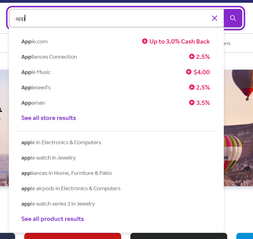
Even if you misspelled your search, it would autocorrect automatically and display correct results (Amazon)
Provided auto suggestions + auto complete (Rakuten)
Results:
Search conversion rate increased by 35%
Time to find a deal decreased by 40%
Checkout engagement increased by 25%
Positive sentiment from user feedback, including testimonials from budget-conscious users
Internal teams (CS, PMs, QA) adopted new workflows and design standards for long-term impact
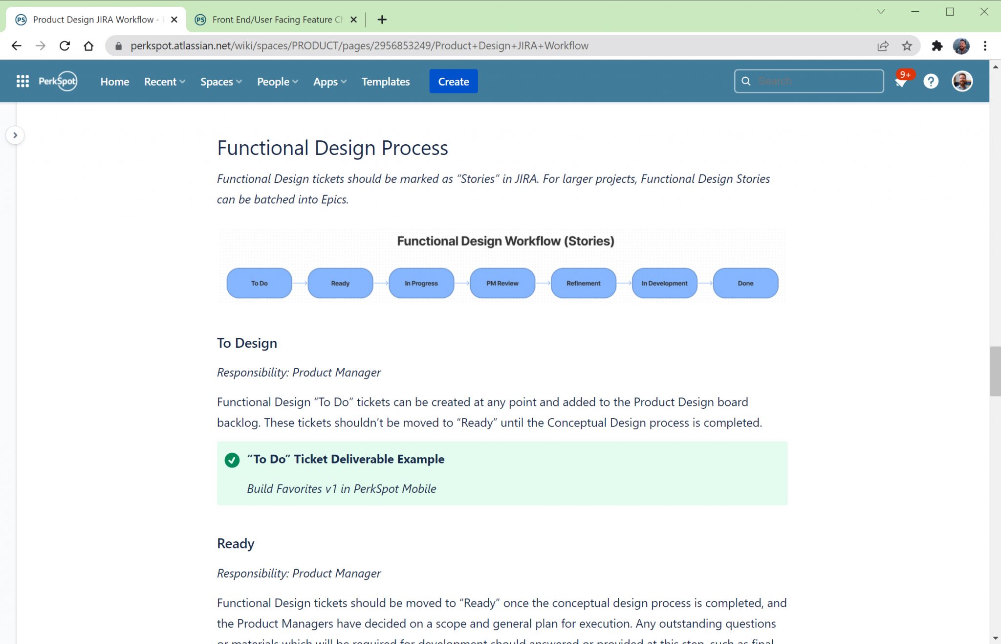
UX Workflow
Partnered with the Principal UX Designer:
• To define a clear, repeatable workflow for designing and developing user-facing features
• Ensured the UX team was involved at every stage of the product lifecycle—from concept to deployment
• Created a structure that allows UX designers to contribute meaningfully throughout the process
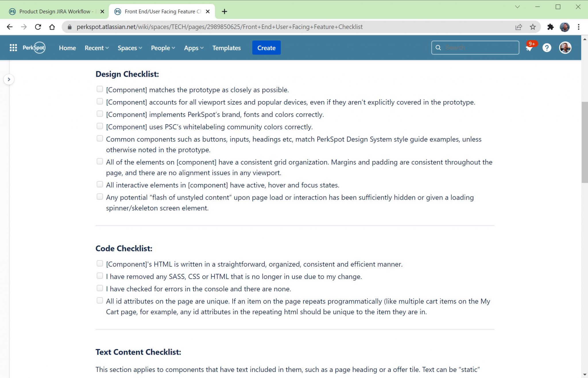
• Developed a practical checklist for PMs, engineers, and QA to ensure all releases meet PerkSpot’s design and accessibility standards
• Helped enforce consistency and WCAG compliance across platforms, improving the overall user experience
The PerkSpot Design System
The PerkSpot Design System is a comprehensive collection of styles, components, design patterns, tools, and best practices specifically crafted to streamline product design processes at PerkSpot. This Design System is implemented as a UI Kit within Figma, providing a resource for designers.
Importantly, the Design System is seamlessly integrated into every PerkSpot technology product, guaranteeing a 1:1 analog representation. This integration ensures that prototypes are constructed using reusable components and standardized design patterns, resulting in efficient development of consistent and accessible products.
Figma Prototypes
PerkSpot's "My Favorites" feature prototypes were efficiently developed in Figma using the PerkSpot Design System UI Kit. These prototypes outline various features and serve as a reference for developers during implementation.
Leveraging the UI Kit ensures swift creation for both the responsive PerkSpot Discount Portal and the Mobile App. Consistent use of the Design System across endpoints enables reuse of design patterns, enhancing consistency and streamlining the design and development process.